
Views from a
Diverse Practice: The Work
of Marcio Kogan
Marcio Kogan founded his architecture practice in the early 1980s while he also developed as a filmmaker. In 2001 he established his practice name StudioMK27, consolidating a brand that led the studio to international presence. Although Marcio’s practice focuses more on architecture and design, his interest in film forms part of his design decisions—intentionally or unintentionally. The studio’s most notable projects are residential, where his obsession with details, material selection, and minimalist resolution is evident.
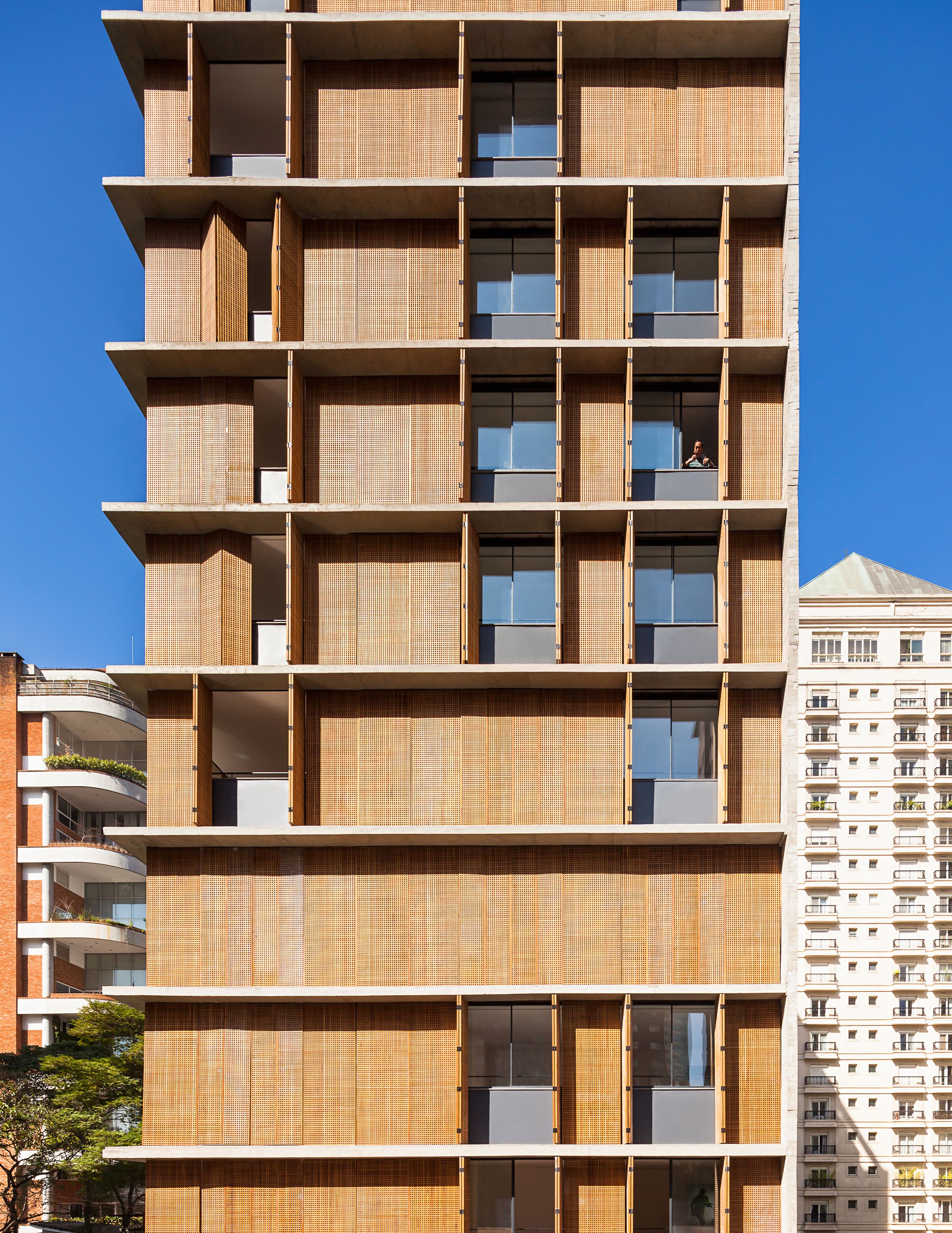
Studio MK27 also handles different scales of design, from objects and furniture—such as the DR bathtub, a flexible tub for two, in collaboration with design brand Agape—to buildings—such as the Vitacon Itaim, a multi-familybuilding with an operable wood screen facade. In his practice he often works with film and installations which inform his architectural projects, and give a way of spatial perception through film. Among one of Kogan’s most notable films is "Fire and Passion" from 1988, a comedy directed with Isay Weinfeld. For the Brazilian pavilion at the Venice Biennale in 2012, his studio also worked on “Peep” with Lea Van Steen, a short film taking place in the Casa V4 showing the viewer a voyeuristic look at the habitants of the house. One particularity worth mentioning of Kogan and Studio Mk27, is that his employees are included as co-authors for the projects they lead, a trait rarely appreciated in the field. Kogan is also involved in academia, where he teaches at the Milan Polytechnic and at the Escola da Cidade in São Paulo. In 2011 he was recognized as a member of the American Institute of Architects.
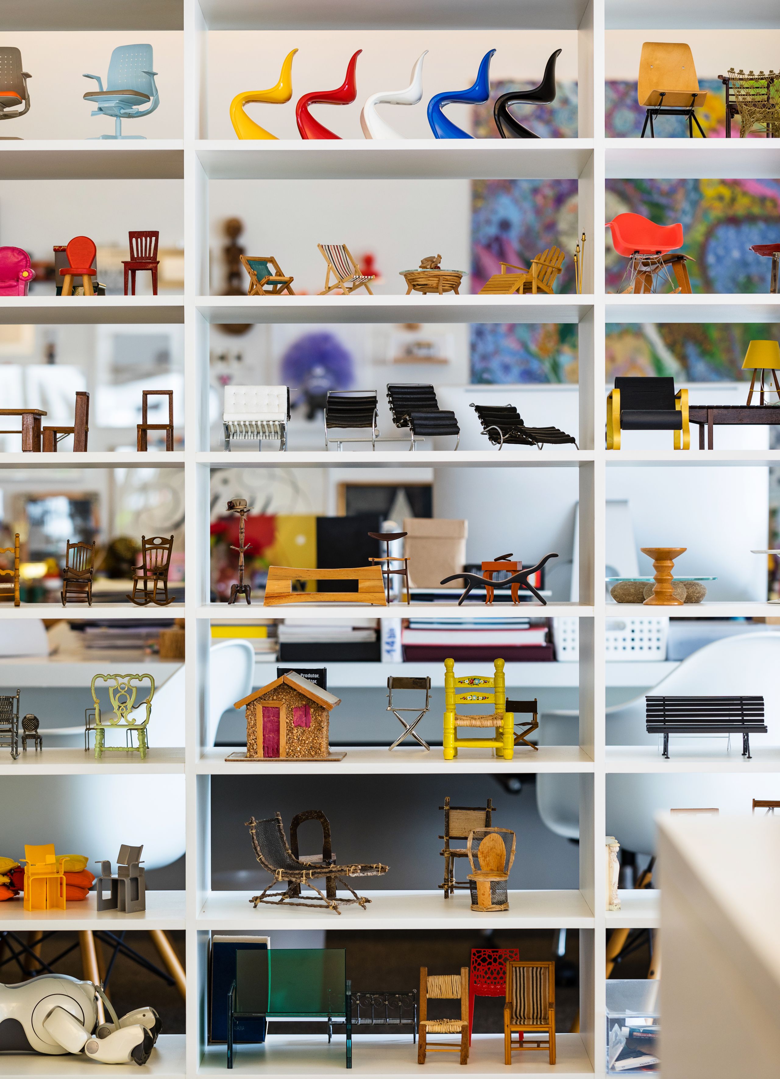
ACP: Looking at photos from your studio, we notice a vast collection of objects, toys, and miniatures. Do these items serve as a source of inspiration or do you have them just for fun or as collectibles?
MK: I am a kind of a minimalist hoarder. I do not have more space to add objects, so now I began to decorate the walls. The objects are not of any meaning. For example, there’s a car toy that a friend gave me. I collected this other object over there when I was teaching in Los Angeles. One day I left the school to have a coffee and I entered abowling center. They had this crawl machine and I only had one coin at the time, but I got the prize. I had never experienced this kind of thing. Therefore, as you can see, they are all stories about my life, simple things.
There is a relation between this kind of thing and architecture. When we design a house, for example, we tend to do something very minimalist but we hope that the client will put their life inside their house. We just created the base; the first day is minimalist but I hope this changes through the rim of time.
Interior of Kogan's studio. Photography by Elton Rocha.
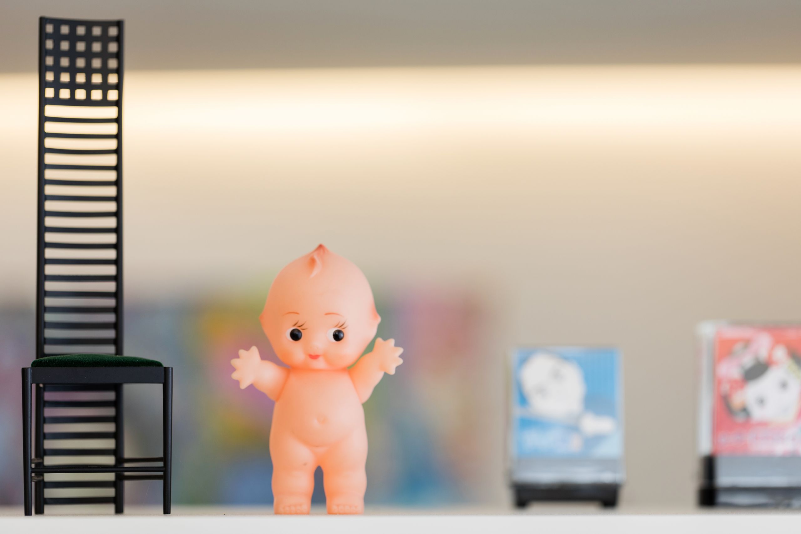
Studio MK27’s logo is a baby doll. What is the story behind the logo and what role does it play in the studio?
We bought this doll in an antique shop in San Francisco, and one day someone in the office asked, “Why don’t you take this ‘baby’ as our symbol?” We began doing this in the worst possible places, like construction boards, and everybody loved it because they said that this was the first time in life they saw something funny in an otherwise very, very boring office. Now we even have a business card with a baby; each architect in the office has a variation of one— with glasses, different hair. It’s very funny, and I like it. For a moment it seemed to deliver something interesting, because architecture is always boring, and you never laugh in architecture.
One day I was giving a lecture in Sao Paulo with 1,000 students in the audience, and at the end of the conference one of the students asked me, “Everything you do is funny, in your films and life, why can’t I see this in your architecture?” And I was silent for one minute, thinking. And I said that there is no “funny” in architecture, never. Only when you see a bizarre building—things in a bad sense—can you laugh.
Photography by Elton Rocha.
Early in your career you attempted full length cinematography with the film “Fuego e Passion”, where you sacrificed your career and finances without success. How did the reconciliation with cinematography happen which led to show Casa V4 through this medium for the Brazilian pavilion of architecture in the Venice Biennale in 2012?
When I entered architecture school, I directed some short films—I did not know if I would be an architect or a filmmaker because I love film. I began a career in movies and even won a lot of awards for them.
During my first years here in the office, we decided to direct a long-feature film, after a very successful career in short films. It was in 1987, “Fuego e Passion”, you know what happened?The film was a disaster. The film was bad. We (Isay Weinfeld) did not have the experience to do a long film, because it is very different from shorts. At the same time I had 6-7 people here at my office the time. But because I needed to stay out of the office for 6 months to work on the film, I lost all my clients and my money. That’s when I said “now it’s over" and I would be an architect 24 hours a day.
Only in 2012, after they invited us to represent Brazil in the Venice Biennale, I decided—after 30 years—to direct a film, a video installation, inside the Brazilian pavilion. I needed 30 years for my trauma to disappear, and after this, we’ve since directed a lot of short films again. Now sometimes my son is the director, or we invited Pedro Kok who is a very important architecture photographer, and Lea Van Steen, who worked in advertising, and director and production designer Jussara Felix Figueredo. We need two, three weeks to do them. And they are not so serious, and give me a lot of pleasure. They all have to do with ways of seeing architecture, yet, all of them are fiction. For example, one is about the way a cat sees architecture projects through his eyes. The last one is a point of view of a bee inside MiCasa Vol. C. I like to do it and show architecture through the films.
Later you developed other short films that show a fictitious plot, from the real one carried by the true homeowner(s); they are portrayed almost as a guilty pleasure. How was the dynamic with the homeowners to make these films, did all of them follow along the idea without objection?
Before starting, we show them what we intend to do, and then they approve or not. Sometimes I even need to specify to them that it is a fictional film, and it is not about the client's life. But when we decided to shoot for the Venice Biennale, the client said that it was okay and had no problem. She left us her house for a weekend, and thank God she was not there. There were 40 people inside the house, and I had to do 50 scenes within two or three days. Around 200,000 people watched the film, and the client did not like it. She thought it was just going to stay inside the Biennale. But the client from the Toblerone House had the opposite reaction; he was part of the whole family in the film and said, “Thank you very much we love to do this kind of thing.”
A good cinematographer frames his images to highlight or hide things, and we can see this in your projects. Service spaces and secondary spaces are sheltered behind compartments that are barely perceived. In the design process, what role does photography play for the spatial composition of the project?
What films brought me to architecture, influenced a lot my life and my career. For example, the influence of the proportion of the project is very related to a widescreen viewfinder. When I began connecting the façade and architectural elements with the proportion of the widescreen, I liked the result very much. The other thing is the importance of light—natural and artificial. When you see our projects with muxarabi screens, we want to create shadows that change throughout the day. And of course maybe the most important thing influenced by film is teamwork.
I began to hire architects that contributed to the office, not only produced, and it changed the courseof history of Studio MK27. If you look on our website, all of the projects have co-authors. This is very good for our profession. And the architects like to work here. They feel they are very important. I am proud of it.
Vitacon Itaim Building
Studio MK27 has projects in several countries. In your repertoire of projects, it is evident the influence of Japanese design with the minimalist aesthetic and use of wood, Islamic architecture with the implementation of ornamental screens, and the tradition of Brazilian architecture with the choice of materials such as concrete in large scale volumes. How are these ideas implemented in other contexts with different climatic and constructive methods for them not to be decorative motifs?
Okay, for example, big screens. They are very related to the colonial Brazilian architecture from the 16th century, and they were very influenced by the Portuguese and Spanish that came to Brazil. And in the case of Spain, there is that relation with Islamic architecture. We are also very influenced by Brazilian modernism, and for me was it’s the best modernism in history. It’s very interesting. Oscar Niemeyer and 12 other very good architects were doing revolutionary architectural work in Brazil. Keep in mind, this took place in the 40s and 50s, which is was very strange. This team in Brazil was doing the best architecture in the world, the best music in the world, but it is very strange how this is an isolated country.
Vitacon Itaim Building
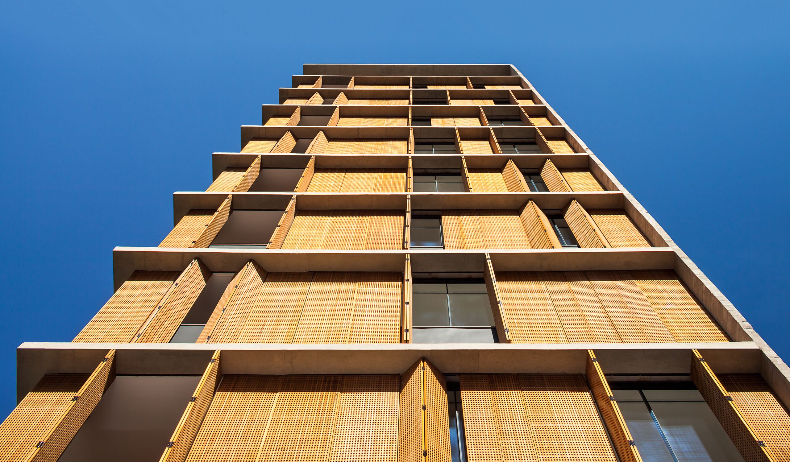
Vitacon Itaim Building
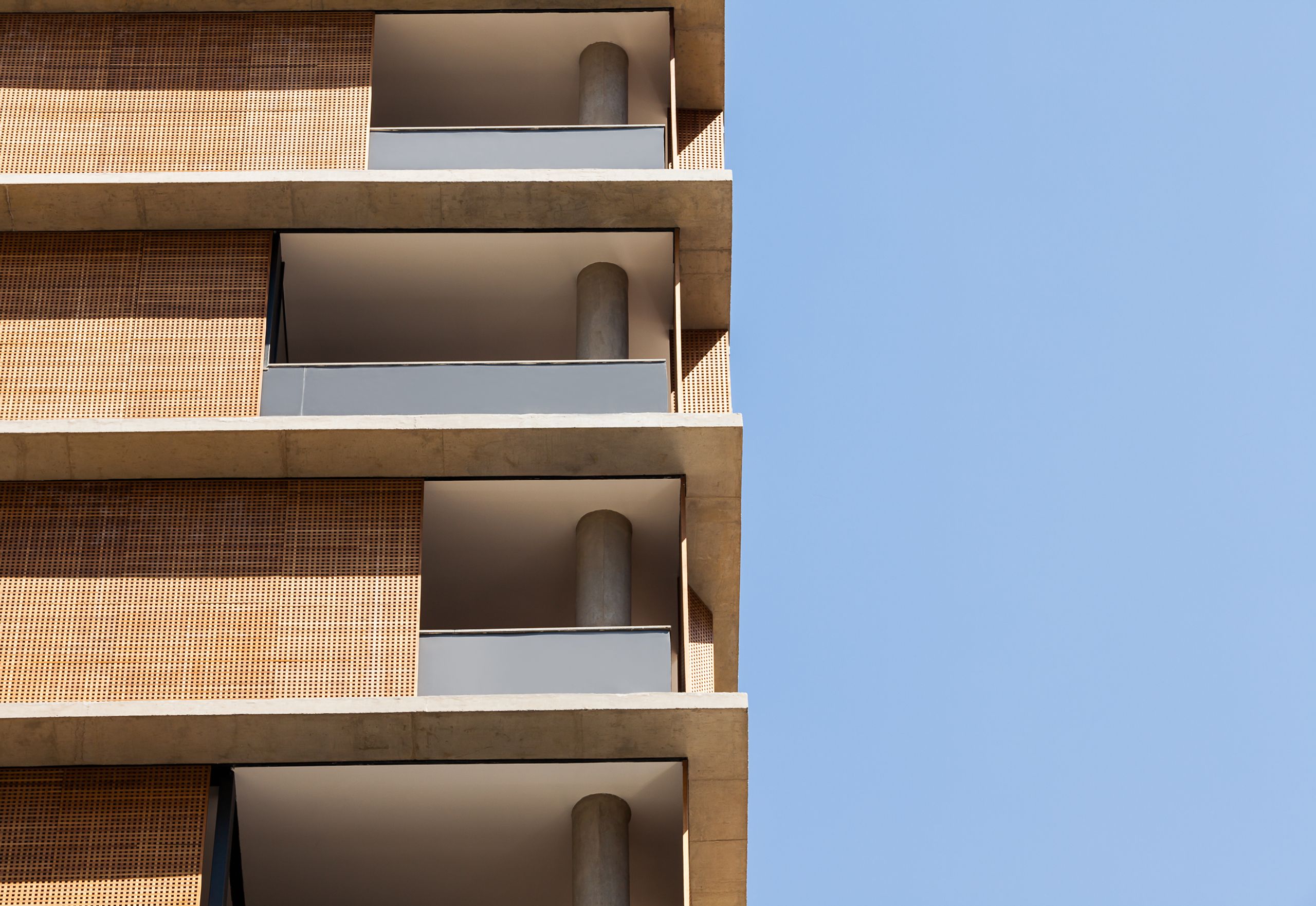
The apartment city project Vitacon Itaim Building—built in a concrete frame with a wooden façade which users manipulate—can be considered a counterpoint to the chaos of the city. What were the challenges with this project and how is the atypical wooden enclosure for this type of building conceived? What role did previous single-family residential projects play in this multi-family building?
Once in a lecture, I said that anything you want to build in Sao Paulo would fit perfectly. Some architects began to argue with me because they did not like the answer, but this is true. When we design, we thrive to do it in a very gentle way. But in the city, you see a modernist building, a Neo French, Neo-Mediterranean, a Greek style. I see everything here. This is Sao Paulo. Epcot Center, it’s here. It is true, and you know? Now I like it because Sao Paulo is Sao Paulo. Sao Paulo does not want to be Paris, New York, or London. It has its own personality, there is a lot of chaos, at the end we love it. It is full of energy. This is important because I can not live in a place like a forest with some cows and snow. No. This is a city, a magical city, with a lot of bad things.
Images courtesy of Marcio Kogan (Protheses Collection)
Images courtesy of Marcio Kogan (Protheses Collection)
Images courtesy of Marcio Kogan (Protheses Collection)
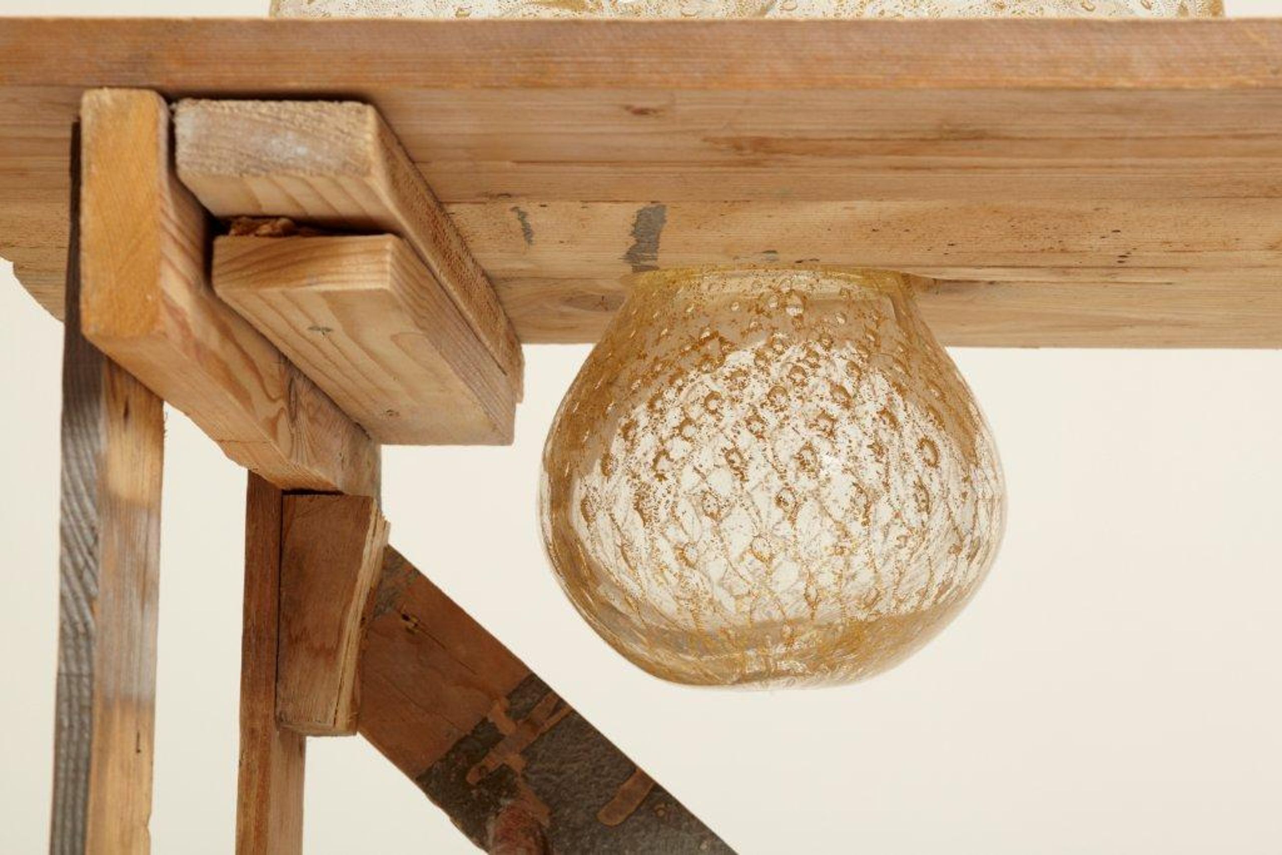
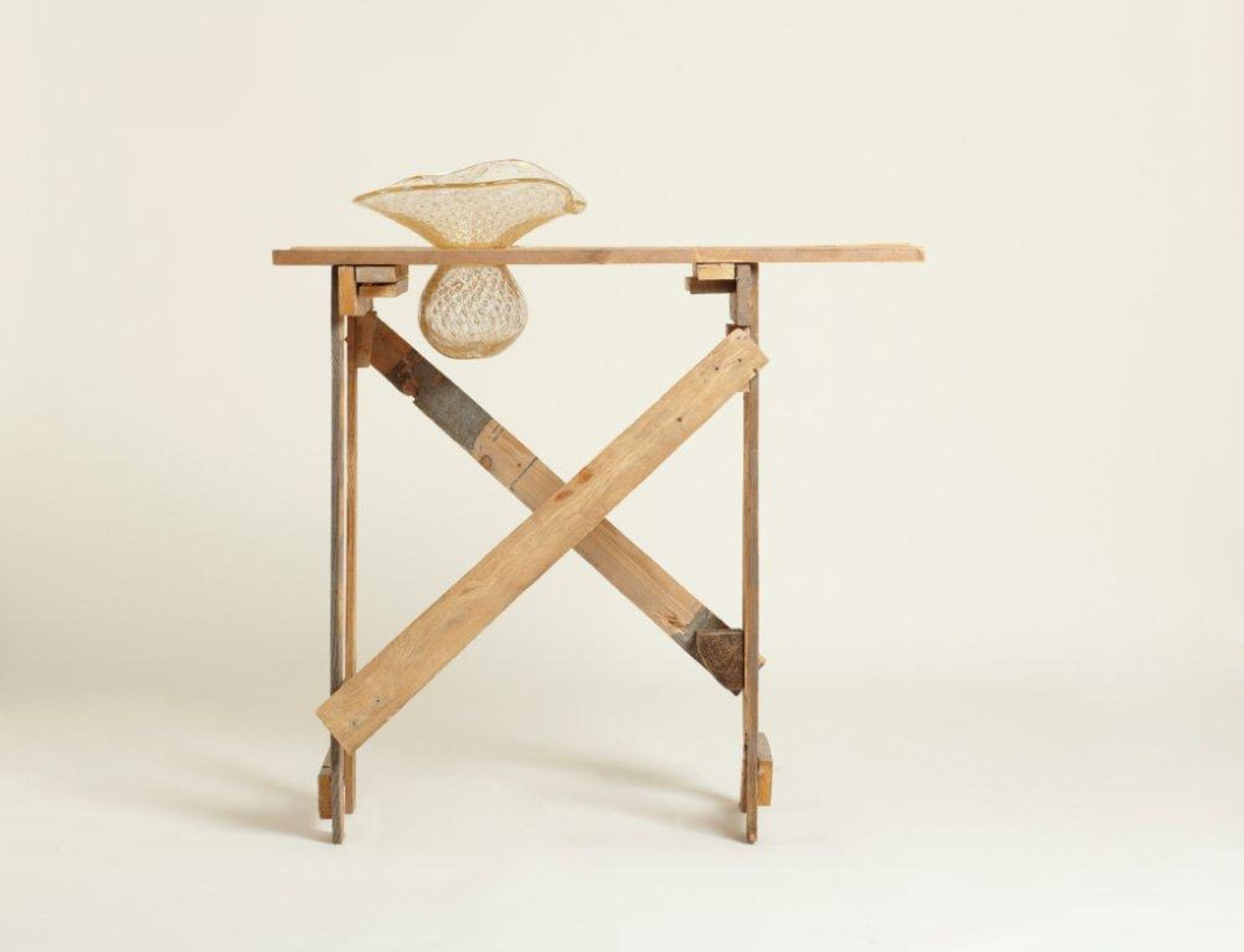
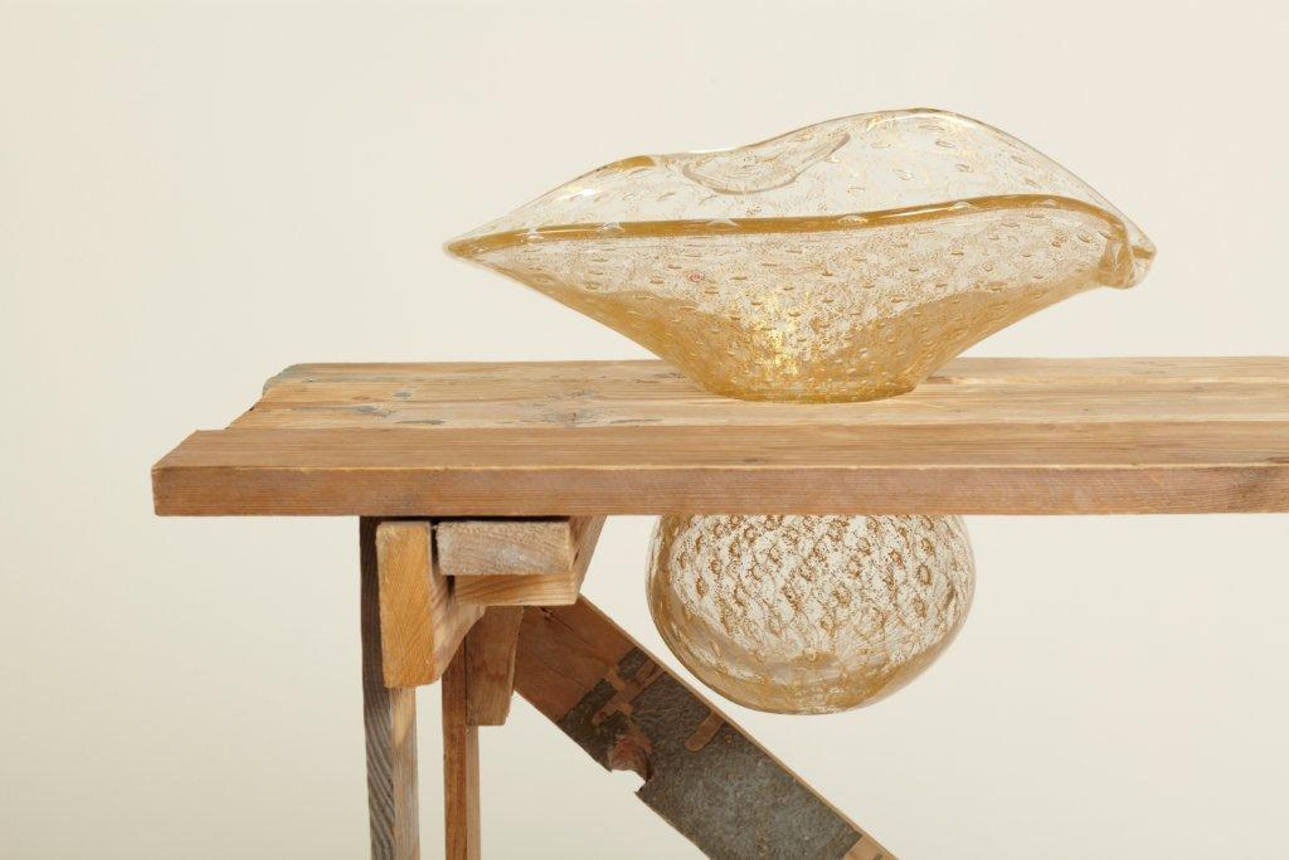
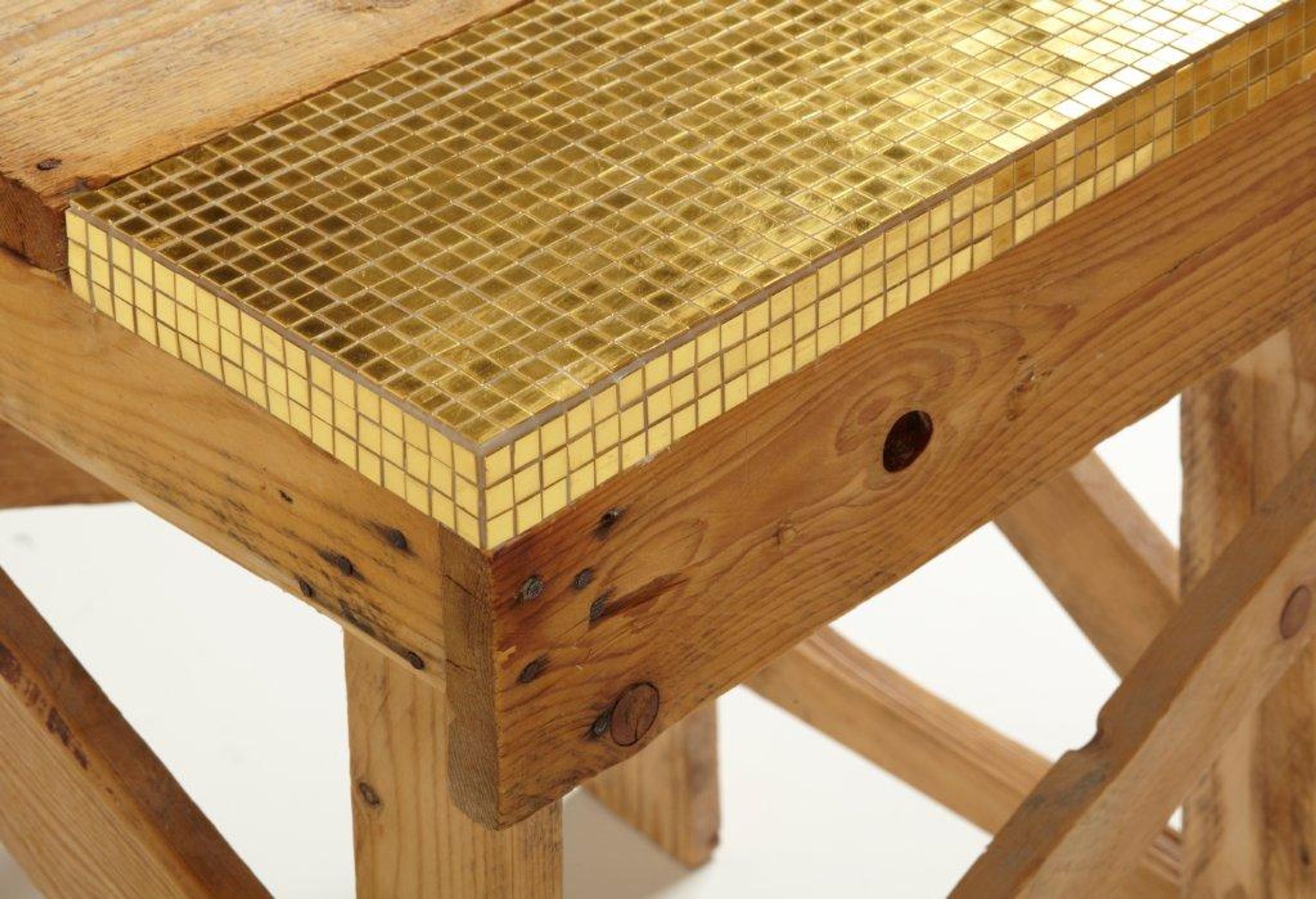
Another facet the studio explores is industrial design. There are two projects which pieces I consider particularly striking: the ones from the Protheses and Innesti collection and the Prothesis and Grafts collection. These pieces use leftover materials from the construction site that often become rubble. These portray a particular symbology because they are firsthand tools of the construction workers which are recontextualized to pieces with other meanings such as stools or tables. How did Studio MK27’s additional intervention decide the new use of the pieces?
When I visit construction sites, I begin to fall in love with what the workers buildwith recycled wood, the furniture, the table, the chairs, sometimes the bed, and this is very interesting. They build something in the most rationalized way, and they do this in a naïve way, and this is very interesting to me. When I arrive at a construction site, they are afraid of me: ‘the guy who stole my last table’. Now I have a lot in the deposit of our studio.
Our work is 100% collaborative, with everyone in the office working in the brainstorming sessions. We put the furniture in the middle and decide what to do. If they need to create a bench for the ledge, they do it in like one hour. It is very naïve, but we get the solution, and it's the same method the builders on the site have—following their instincts.
Images courtesy of Marcio Kogan (Protheses Collection)
You have a significant number of residential projects. These types of projects are complex and slow in nature, because dealing with a client while designing a personal project such as their homes can be strenuous and difficult. Are the explorations of other projects related to industrial design and cinematography a way to create projects with shorter time frames compared to residential projects' time consumption? Do you view them as side projects to freely enjoy in between larger scale projects?
After I graduated, I wanted to design social housing. I studied and visited a lot but it was impossible to do it. I think that in Brazil the politicians treat poor people very badly; they do not care if they will live in a better place or not. This is true. If you are trying to find good social housing in Brazil, you will find three or four good ones, but the other one million, they are not. One day, the telephone rings and a client asked me to design a house. I designed it and I liked it because I am a perfectionist. I belong to the culture of drawing; I like to draw a lot. I have millions of pages. And with this kind of luxury house, it is a good place to do this kind of thing, the clients let you do it. This house was a huge success, and I began to be known as a luxury house designer. This is life, completely different from what I intended. It was not my choice. I needed to survive, saw this very good opportunity, and that is it.
We began to design houses, and the first one was published in 100 magazines around the world, and people loved it. We began to be known as an office that designs houses. The story was that we did not design the interiors, and one day, when the clients moved to the house, they destroyed the project. After that experience, one of our clients needed to move to another city and I asked if I could take a picture of the house we designed for them, which was completely empty at the time. Within a day or two, we rented a small truck, we brought a lot of furniture, and we finished the interior design in two days. I decided to give the interior design project for free to the clients. After that, we decided to do interiors.
I lost a lot of money at that moment, but I learned how to design interiors. Even the Italian industry began to like and follow our projects in magazines, and two or three companies called us to design industrial things for them. We have designed some products for Agape and recentlywe designed a lot of things for Minotti with great success. We have been told that the products that we design are best sellers.But this is all a consequence of designing that one house.
We now have a small team designing products, and we began getting calls to design hotels. Now maybe 30-40% of our work are houses. We have a lot of hotels going on and we are also designing the headquarters of a finance company from Sao Paulo. Different project, but the main thing is houses. However, they are very difficult to do because the clients are not so easy. What happened is that the things that I could do in one or two days, the clients prolonged to two years and it's a nightmare. Mainly in interiors, more than architecture. They think that they know everything. And one important thing, you need to be a psychologist.
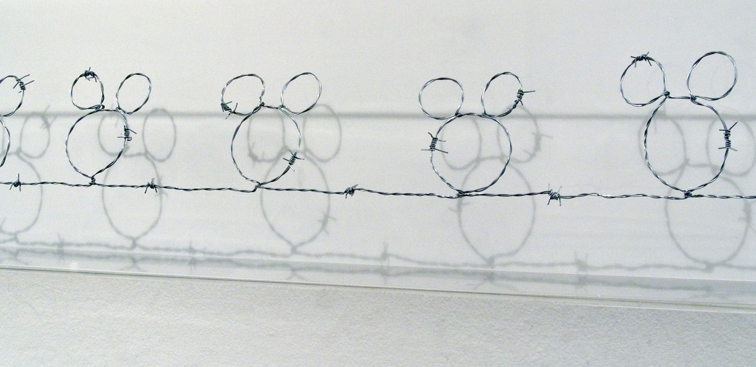
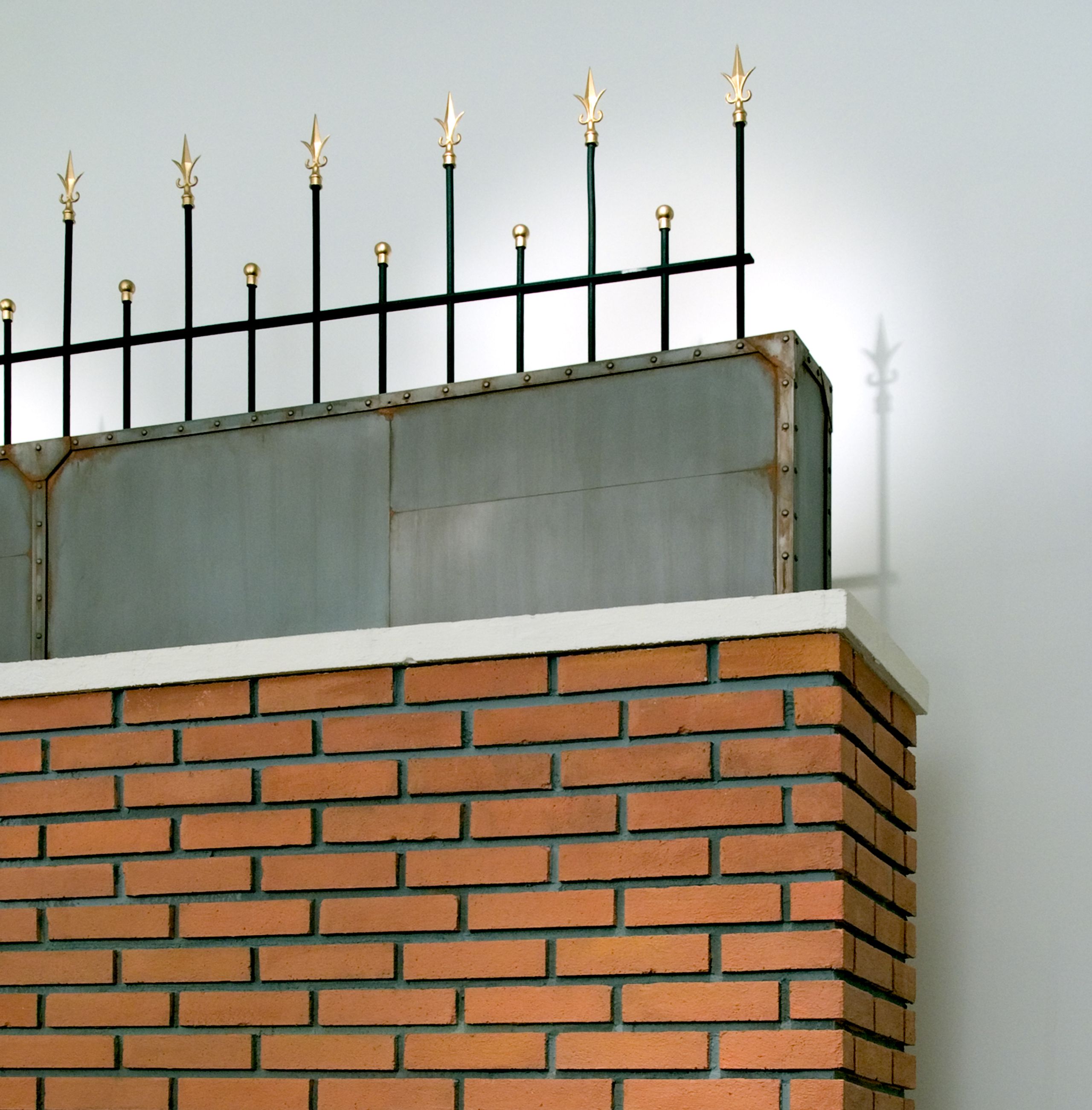
In the early 2000’s you worked on an exhibition with Isay Weinfeld titled Happyland and Happyland Vol.2, exploring social and urban topics. The use of physical models, photography, and installation pieces, represent a chaotic city describing situations of daily life that sound absurd, but those who live there feel happy. Happyland Vol.2, describes the incidents of the city of Sao Paulo. How do these types of ironic and factual urban reflections influence decision-making when you are designing in the city?
Happyland Vol.2
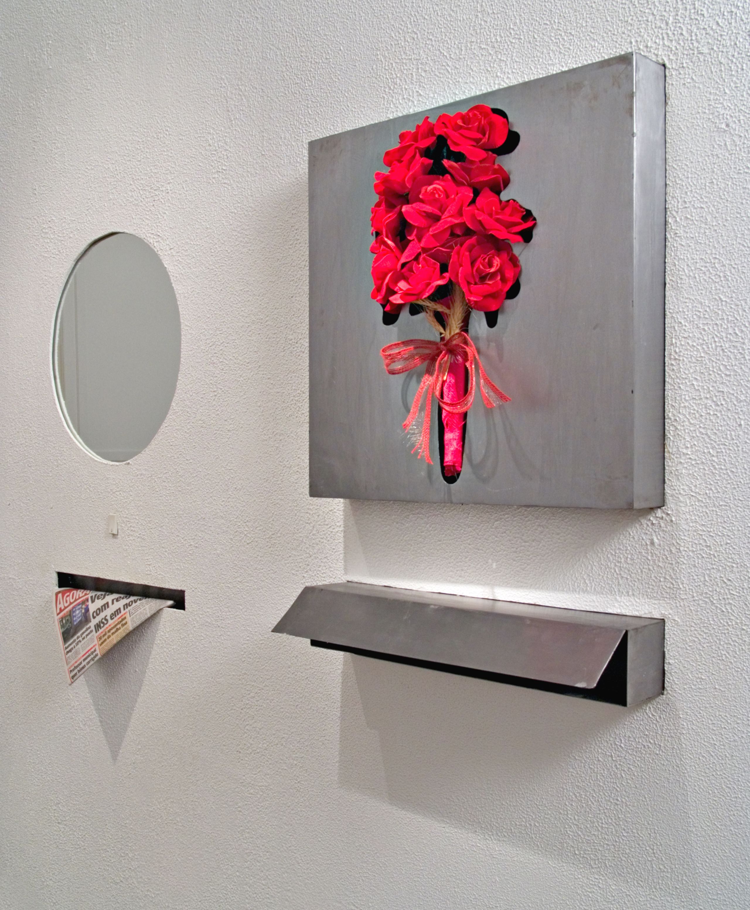
During my school years, projects were very conceptual. All of them were very ironic, strong social critics, and with humor. And one day, when I finished school, I did not know how to design anything, because I just did this kind of theoretical and conceptual projects. I needed to learn architecture after I graduated, and after 10 years talking with Isay, he asked, “Why don’t you do this project again?” We built a big model of the city, which was Happyland 2. And this was a bit of an ironic vision of Sao Paulo, the violence, the chaos. And then you see, this is happening around. There is an impact to this project. You need to have big walls around the plot, some armored cars, and when you design apartment buildings you need to have strong security. This is the way we live.
What is funny is that one day I was in this award architecture festival and I met a landscape designer from Lebanon. We became very close friends after that. I worked a lot with him on a lot of projects now. He was shortlisted for a square. He designed it as a tribute to Lebanese leader they say was guilty and killed. He designed a very nice square but there’s a fence around it.
The jury there were almost all of them from England, they did not understand, they thought it was ridiculous to design a square or plaza with fences around. This is not correct, but this is the reality of the place. Of course, it is very sad.
Happyland Vol.2
Happyland Vol.2
Happyland Vol.2
We are all under this new reality of a pandemic, where technology has helped to appease our daily lives. How this affected the design process and how do the dynamics occur in current under-construction projects, since many of them are built outside your country?
The projects now, I designed with my architects approximately 8 hours a day in Zoom. You can design squares and circles. The architecture now is basic. But it is working. I think a lot of things will change, but in the end, it will always be the same. A lot of clients are asking for a workspace, to work from home.
Marcio Kogan
Architectural Designer
RossiLugo Architecture (San Juan, PR)
Alexander Cuesta-Pantoja is an architect and designer. He holds a Bachelor of Architecture from the School of Architecture of the Polytechnic University of Puerto Rico. Besides working in a local architecture office, he works on objects and urban furniture design projects intimately related to architecture. He has participated in object design exhibitions such as the opening exhibition of the MADMi “Todxs a todo” in San Juan. Recently he investigates and questions the rehabilitation and adaptation of buildings, especially that of the recent past. He is a frequent visitor to archives in search of plans, publications, and maps; and enjoys analog and digital cartography.